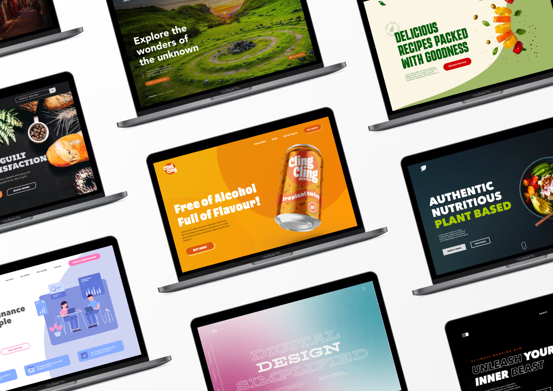
Developing a strong user experience strategy is the first step to creating a website that stands out amongst the crowd. By giving users a smooth journey through your website, you are on your way to creating a memorable and enjoyable experience. Having a well-thought-out UX strategy will improve engagement and increase conversions.
The first things a user will usually notice when visiting your website are the images, graphics, and colour palette. By making the most of eye-catching visuals that bring a sense of curiosity, you are one step closer to keeping the visitor engaged. Understandably, not everyone can afford to hire a photographer or designer to create visuals for their brand. Luckily there are some great free resources to get high-quality and royalty-free content. Some websites worth checking out are:
However, using stock photos does have its drawbacks. It is possible that your competitors may had the same idea. There is also the chance that they don’t truly represent your brand. In the age of AI, we have the option to create bespoke visuals at a low price. If this is an option you would like to consider, Dall-e is a tool worth exploring.
Interactive elements are a great ways to make your website stand out. When a website loads, a user expects it to be static with no moving parts. By having a dynamic and interactive design, users are instantly engaged! It adds to the experience and immerses them in a unique journey.
A few ways to make your website interactive include a loading animation, mouse position interactions, and scroll interactions. A website that I recently created and takes advantage of this approach is neter media, which can be seen on my portfolio.
With the tools available today, designing interactive content has become very user friendly. Webflow is a perfect example. It is a low-code design platform that has no design restrictions. It gives the ability to create an engaging interactive design that will make your site stand out the moment it loads.
In web design, it's important to make good use of hierarchy. The practice of having a primary element that users can focus on makes content easier to digest. It takes the user through a journey and lets them know what they should focus on first. However, not all websites will suit big and bold type. It is important to figure out whether this is applicable to your brand before going with this approach.
Where necessary, bold and big typography is a simple way to make use of hierarchy while making your copy easy to read. When done right, the font becomes a design element in itself, creating a simple yet engaging design.
Over 60% of all web traffic comes from mobile users as of 2022. Having a mobile-friendly website design is crucial to delivering an effective and stand out experience. Although it is common practice for websites to be responsive, it is still a very important part of developing an effective website that is often overlooked. Responsive websites are favoured by search engines. By having a mobile friendly website, we can boost SEO rankings.
To create an effective responsive site, the limitations of mobile must be considered. For example, a desktop can make use of hover effects, where as a mobile can’t take advantage of this.
I have a whole article about the importance of mobile friendly web design, check it out to learn more.
Storytelling is a great way to position your business and website as a trusted and well established player in the market. If you provide a great service and receive positive feedback, make sure to capitalise! Show off your great work on your website, create customer success stories and create a desire to work with you.
Becoming a trusted source can be difficult, especially when you’re first starting out. We can minimise this barrier by giving your prospects something to relate to. A story that they want to be the subject in is a simple method to make your website and business stand out to potential customers. It creates a sense of eagerness to become the subject in that success story.
In a nutshell, we must consider the UX before anything else. This is crucial to developing a positive experience for visitors to your website. Make sure to utilise eye-catching visuals. This includes images, videos, illustrations and copy. Interactive elements such as animations, hover effects, are great examples of interactions. Big and bold type have their place. When applied effectively, we can make great use of hierarchy with an effective design. The majority of web browsing is now being done through mobile. To engages users, mobile must be valued equally to desktop. Story telling helps bring excitement to your potential customers. It puts your prospects in to your customers shoes. With an effective story, we can create a desire to have a story of their own.