Going Green Media does an amazing job documenting sustainability, but their digital presence didn't quite reflect the innovators they celebrate. They reached out to me with a dual challenge: their website was generating a significant footprint of 0.89g CO₂ per load, and the brand lacked the professional polish and scalability needed to grow past their current "pigeon-hole."
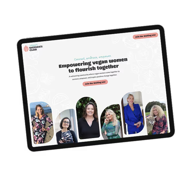
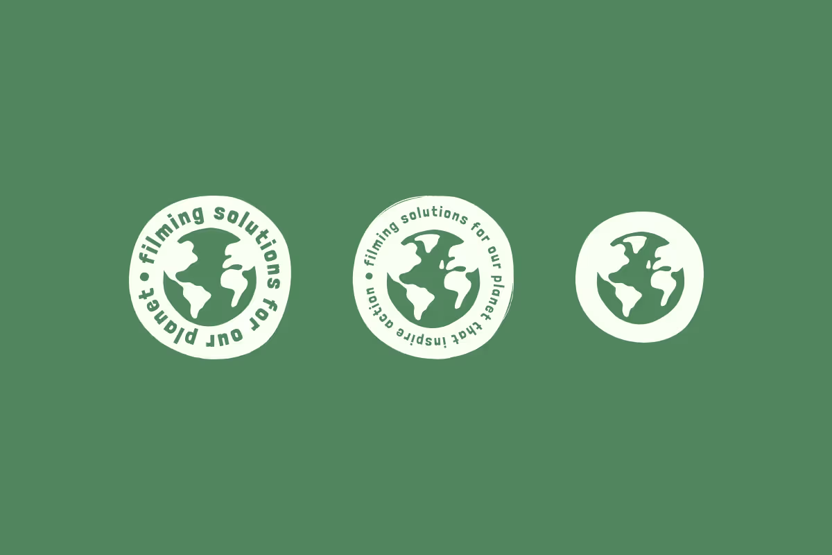
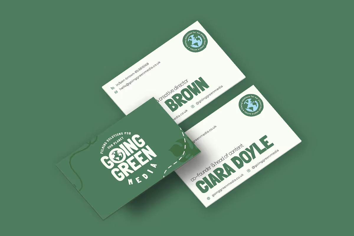
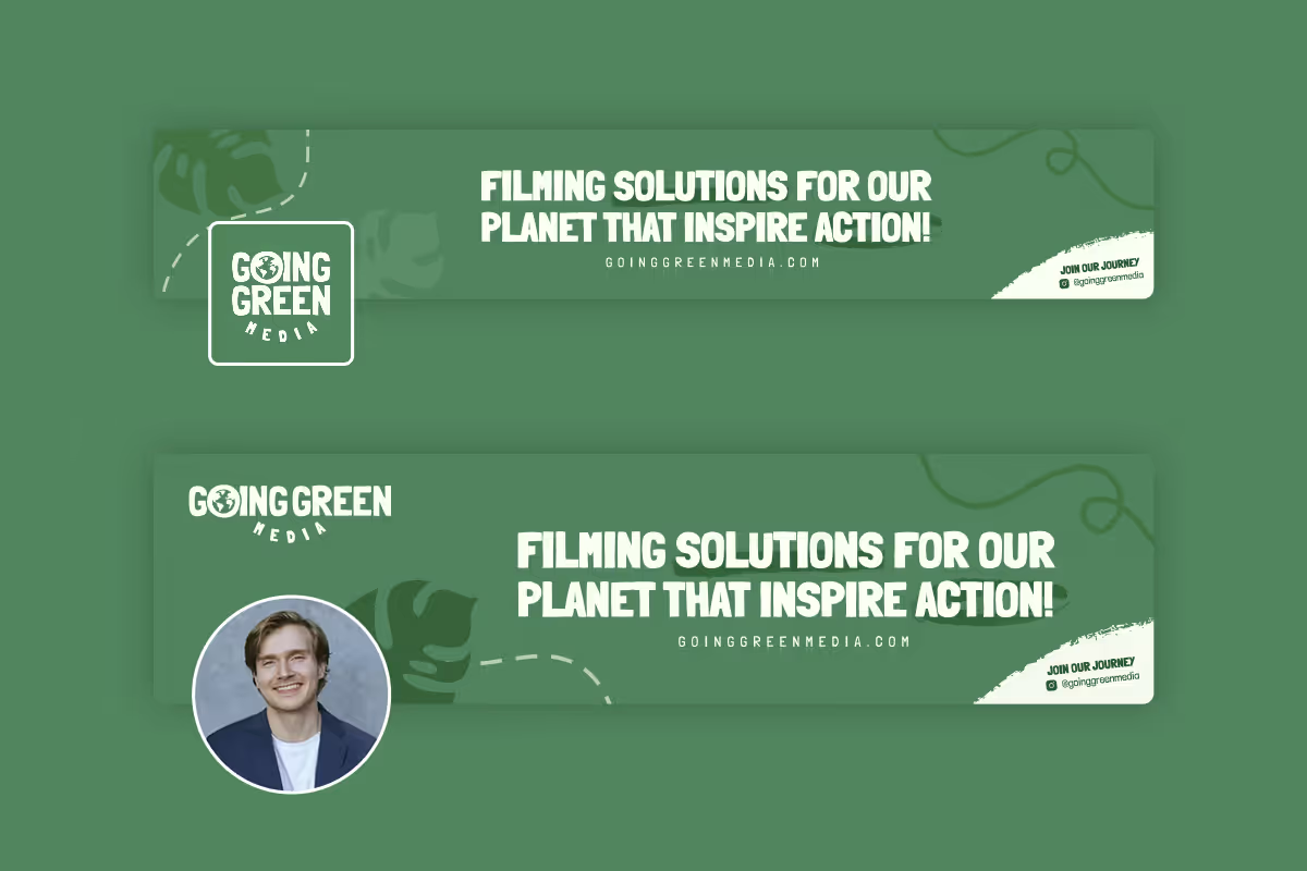
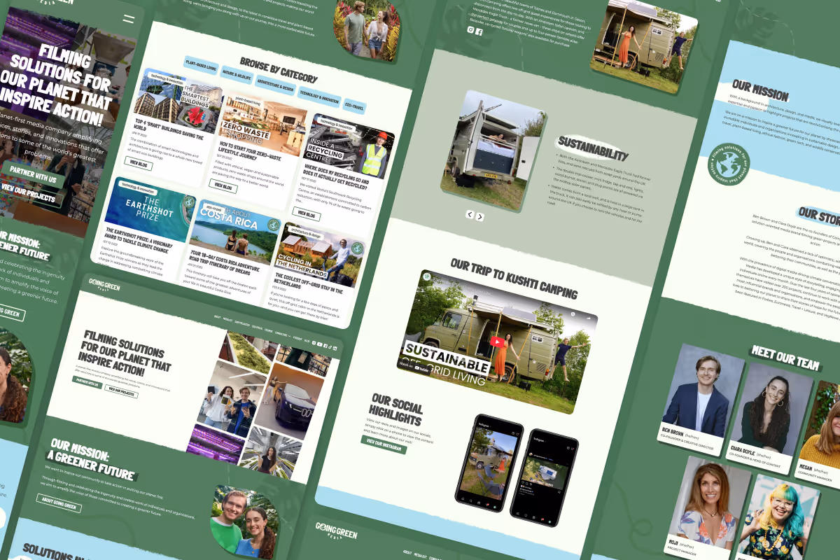
We began by completely reimagining the brand identity. The goal was to strike a delicate balance, positioning Going Green Media as experts in the sustainability sector while maintaining the fun, accessible energy that makes their mission so inclusive. We rebuilt the user journey from scratch, creating a tailored path for both B2B partners and B2C viewers, ensuring that whether a user is looking for an eco-stay or their media kit, the experience is seamless.
On the technical side, we didn't just aim for a better look, we aimed for a lighter footprint. Through sustainable design principles, we successfully reduced their digital footprint by 77% (dropping the output from 0.89g down to just 0.2g per page load). The result is a vibrant, scalable, and high-performance platform that proves sustainability can be professional, functional, and full of character.

To achieve the goal of a 15% decrease in Co2 from page load, the approach combined being efficient in both design and development. It was crucial to make decisions that ensured the website was sustainable at build and maintainable by Going Green Media moving forward. This strategy began during the sitemap and content architecture phase, where the UX was designed to ensure each page contained only the content relevant to that part of the user's journey. This not only decreases the digital footprint but also allows for a smoother, tailored browsing experience. In development, all files and content were converted and compressed to eliminate unnecessary data loading. This included utilising AVIF and SVG images where possible and uploading fonts as WOOF2, decreasing the energy needed for each page load. Finally, all styles and classes were built at an HTML level, minimising the code required for design while building a website full of character and with a minimal footprint
A priority for Going Green Media was to position themselves as the experts they are, with the ability to scale and expand on their capabilities when necessary. My focus was on building a smooth, professional experience for their users while ensuring their content could be showcased effectively and in a way that spoke to the relevant user. To achieve this, the website's content architecture and sitemap were rebuilt, giving content room to breathe and taking users on a relevant, seamless journey. Since Going Green Media targets both B2B and B2C audiences, we created tailored paths:
For B2C viewers, we guided them towards a filterable catalogue of projects, eco-stays, and blogs that sparked their interest.
For B2B partners, the journey was focused on discovering their media kit and easily guiding them toward contacting for partnership opportunities.
A seamless and tailored experience was built for both user types to provide relevant content and demonstrate their authority. To ensure future growth can be handled effortlessly, tailored tutorials were provided to Going Green Media for uploading content, creating pages, and expanding their newly built platform.


We could not be happier with the outcome of Dan's rebrand and sit design for us! He truly understood our needs, what we were looking for, and ensured that our website's carbon footprint stayed as low as possible. He infused fun web design with the more polished look we were going for and we truly couldn't be happier. Highly recommend and thank you, Dan for all of your hard work!

Ciara Doyle